How to Choose the Perfect Font for Your Brand in 2025

Fonts Are More Than Style—They’re Soul
When someone encounters your brand for the first time—on your website, packaging, or Instagram grid—they feel something.
Often, it’s not your logo or tagline that makes the first impression.
It’s the mood of your font.
Typography is your brand’s body language. And just like a handshake or a smile, the wrong one can feel off, while the right one? It clicks.
In a world where people crave authenticity, the fonts you use can quietly say: “This is who we are. This is what we believe. Welcome.”
Step 1: Let Your Brand’s Personality Lead
Before picking a font, pause. Breathe. Ask yourself:
What emotions do I want people to feel when they see my brand?
If my brand could speak, what would its tone sound like?
Here’s how that translates into typography:
| Brand Vibe | Font Style |
|---|---|
| Timeless, Elegant | Serif |
| Minimal, Honest | Sans Serif |
| Playful, Unique | Display or Handcrafted | Romantic, Poetic | Soft Serif or Script |
This isn’t about trends. It’s about resonance.
Step 2: Know the Three Main Font Types (and Their Feelings)
Serif Fonts – Classic & Trustworthy
Fonts with little “feet” or strokes on the edges of letters. They bring history and calm.
Best for: Brands that feel rooted, literary, artisanal
Example: Olive & Figs
Think: bookshops, florists, cafés, conscious luxury

Sans Serif Fonts – Clean & Modern
Straightforward and easy to read. They feel current and honest.
Best for: Lifestyle brands, digital products, wellness spaces
Example: L’Argentine
Think: skincare lines, studios, bistros, hospitality brands

Display Fonts – Expressive & Bold
Big personalities. Often decorative or unconventional.
Best for: Logos, packaging, statements
Example: Philosykos
Think: fashion campaigns, boutiques, art-led brands
Step 3: Pair Fonts Like a Designer, Not a Robot
Pairing fonts is like hosting a dinner party. They don’t have to be alike—but they should get along.
Here’s how to keep the harmony:
Use contrast wisely: If one font is expressive, let the other be neutral.
Prioritize legibility: Your main text should never be hard to read.
Stick to two fonts—maybe three. Simplicity builds trust.
| Heading Font | Body Font | Feel Like |
|---|---|---|
| Olive&Figs | L'Argentine | Classic with a modern twist |
| Phikosykos | Auckland | Artistic yet grounded |
| L'Argentine | Helvetica Neue | Polished and airy |
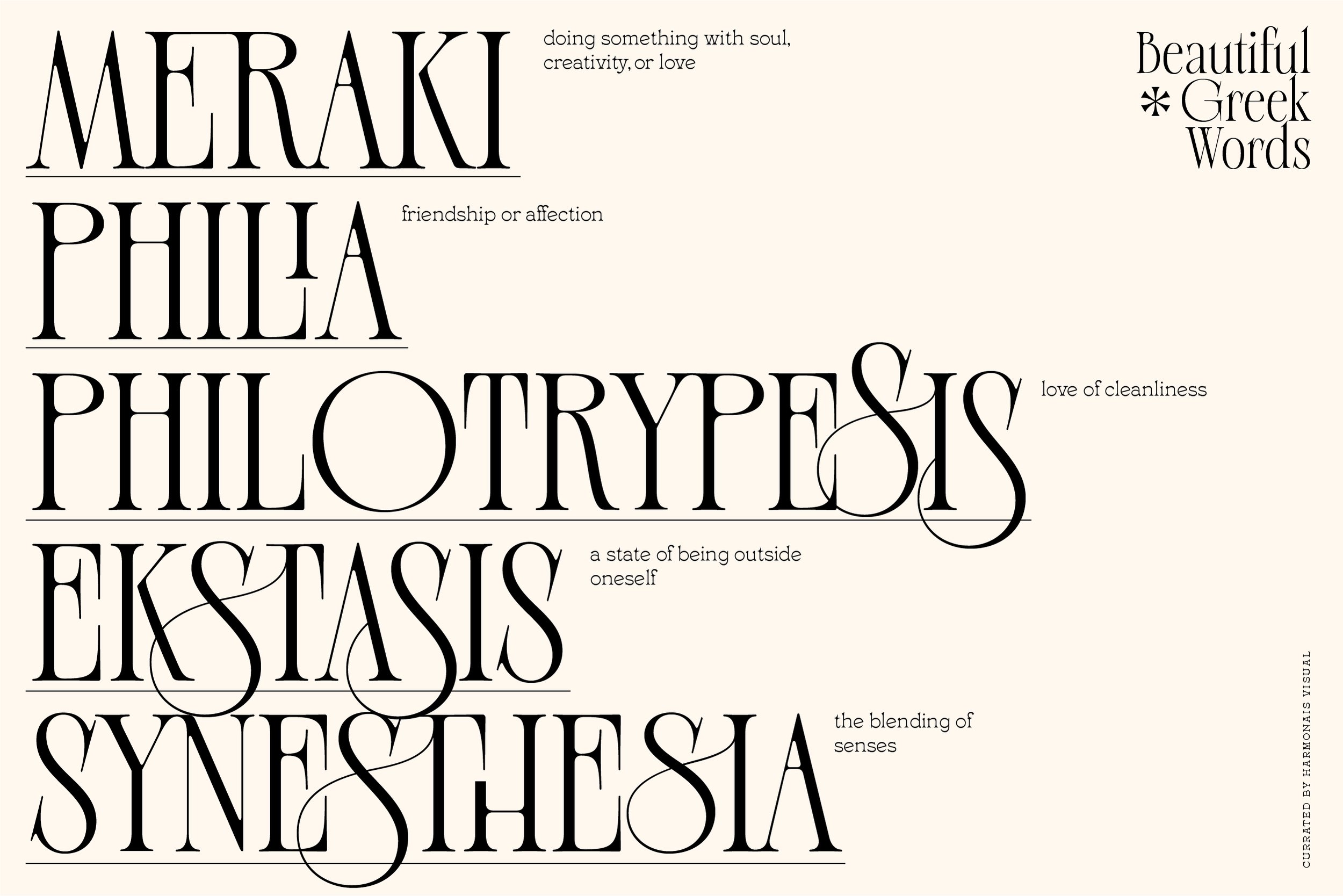
Step 4: Fonts from Harmonais Visual That Speak With Heart
Every font we create is a quiet collaboration—with emotion, with memory, with beauty.
Here are four that were made to feel timeless and human:


✨ All thoughtfully crafted to support branding, packaging, websites, and storytelling.
Licensing Should Be Clear, Too
Fonts are tools, but they’re also assets. To use them properly, make sure you choose the right license.
We keep things simple:
Desktop License – for logos, graphics, packaging
Web License – for embedding on your site
App or Platform License – for developers and integrations
Choose With Feeling
When you find the one—the font that mirrors your voice and supports your story—it won’t just look right. It will feel right.
It will give your brand space to breathe.
It will whisper to your audience, “You’re in the right place.”
And that’s what great design does—it welcomes people in.
So don’t just choose a font.
Choose a feeling.
Choose something that feels like home to your brand.